Palmer Penguins Data Example
Erin Dahl
June 6, 2024
Source:vignettes/non-microbiome_data.Rmd
non-microbiome_data.RmdApply the microshades palette to non-microbiome data
To apply a microshades palette color to a plot, use
scale_fill_manual().
The following examples use the palmerpenguins dataset to show how to apply the color palettes to non-microbiome data.
This first example examines the number of each species of penguin. The different color shades represent the island that the penguin was located.
library(palmerpenguins)
library(microshades)
library(dplyr)
library("ggplot2")

data(package = 'palmerpenguins')

ggplot(penguins, aes(species, fill = island)) + geom_bar() +
         scale_fill_manual(values = microshades_palette("micro_green"))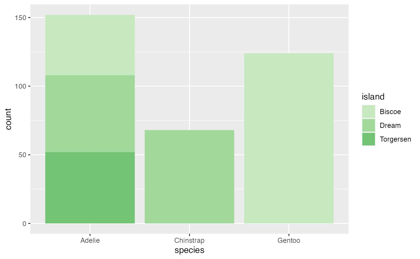
This next example examines the flipper length to body mass measurements between different penguin species. To add an enhanced detail to the visual, a combination variable was created in this example that contains the species and year. The different base colors represent the species and the shades represent the year that the data was collected.
penguins_mod <- penguins %>% mutate(combination_variable = paste(species, year, sep = "-"))

hex_values <-c(microshades_palette("micro_green", 3, lightest = FALSE),
               microshades_palette("micro_blue", 3, lightest = FALSE),
               microshades_palette("micro_purple", 3, lightest = FALSE))

ggplot(penguins_mod, aes(x = flipper_length_mm,
                            y = body_mass_g)) +
  geom_point(aes(color = combination_variable)) +
  theme_minimal() +
  scale_color_manual(values = hex_values, na.translate = FALSE) +
  labs(title = "Penguin flipper and body mass",
       x = "Flipper length (mm)",
       y = "Body mass (g)",
       color = "Penguin Species and Year") +
  theme(legend.position = "bottom",
        legend.background = element_rect(fill = "white", color = NA),
        plot.title.position = "plot",
        plot.caption = element_text(hjust = 0, face= "italic"),
        plot.caption.position = "plot") +
  facet_wrap(~species)
## Warning: Removed 2 rows containing missing values or values outside the scale range
## (`geom_point()`).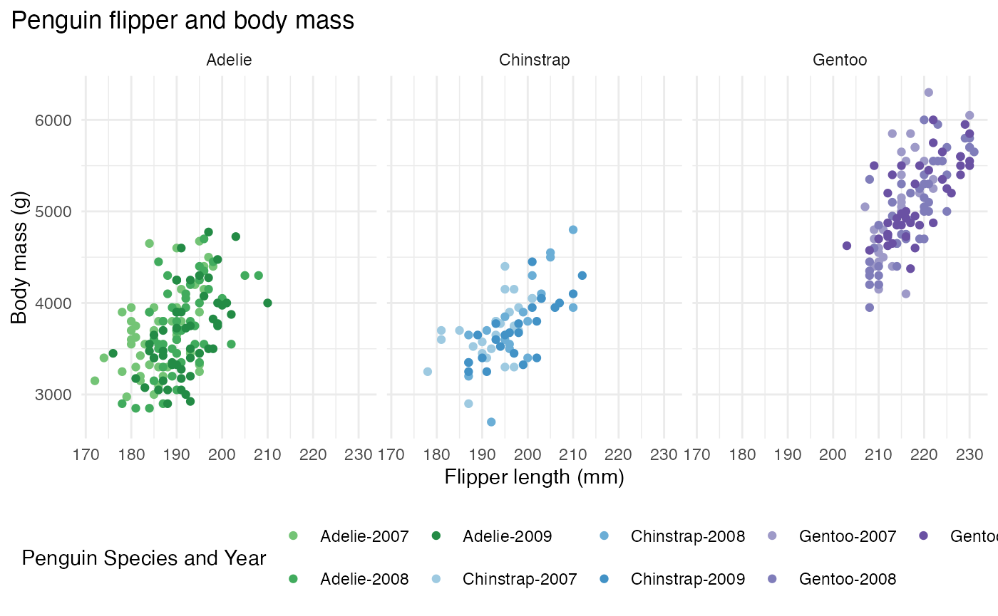
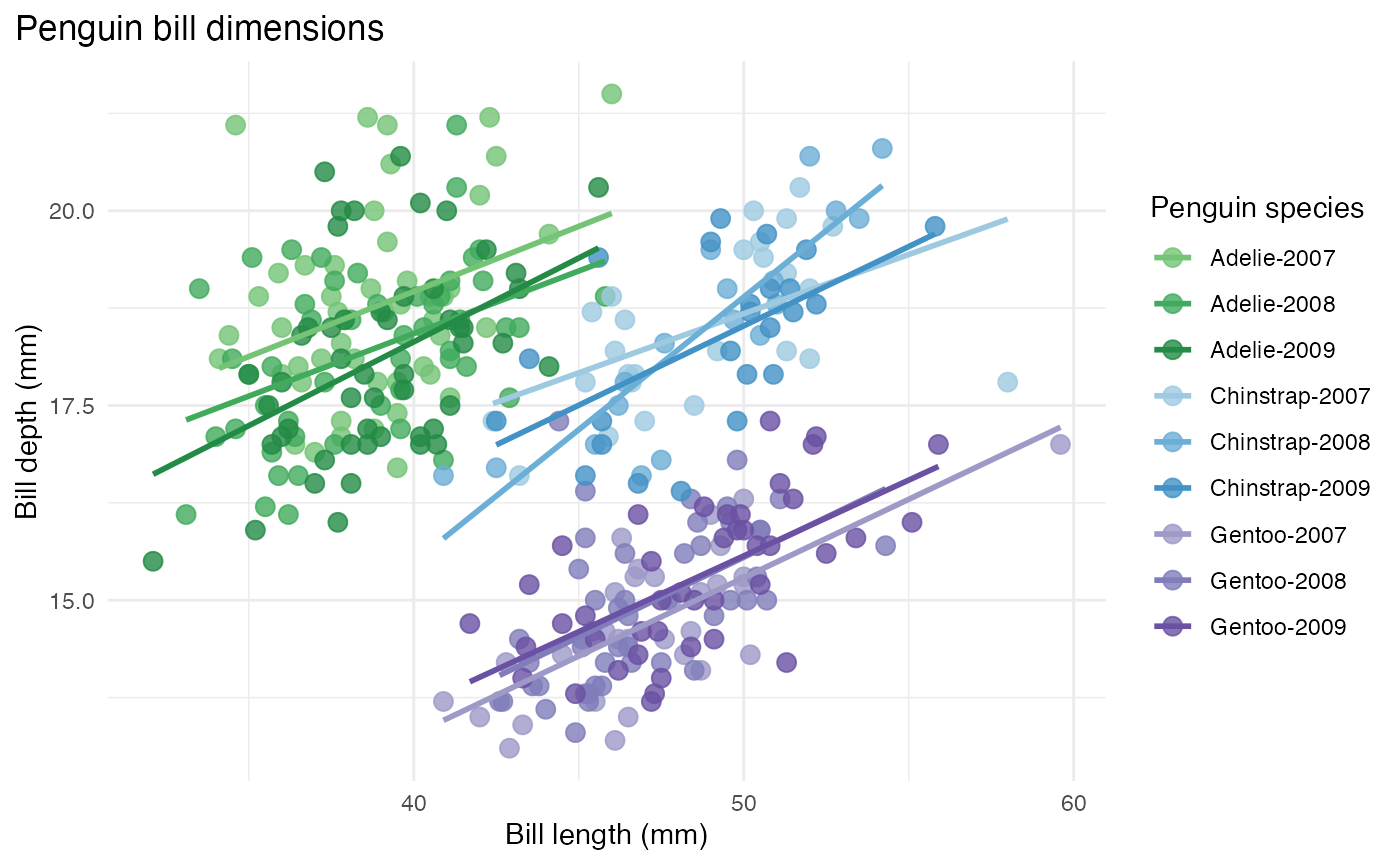
This last example examines the bill length to depth measurements between different penguin species. The combination variable generated for the previous example is used for this plot as well. The different base colors represent the species and the shades represent the year that the data was collected.
bill_len_dep <- ggplot(data = penguins_mod,
                         aes(x = bill_length_mm,
                             y = bill_depth_mm,
                             group = combination_variable)) +
  geom_point(aes(color = combination_variable),
             size = 3,
             alpha = 0.8) +
  geom_smooth(method = "lm", se = FALSE, aes(color = combination_variable)) +
  theme_minimal() +
  scale_color_manual(values = hex_values, na.translate = FALSE) +
  labs(title = "Penguin bill dimensions",
       x = "Bill length (mm)",
       y = "Bill depth (mm)",
       color = "Penguin species",
       shape = "Penguin species") +
  theme(legend.position = "right",
        legend.background = element_rect(fill = "white", color = NA),
        plot.title.position = "plot",
        plot.caption = element_text(hjust = 0, face= "italic"),
        plot.caption.position = "plot")

bill_len_dep
## `geom_smooth()` using formula = 'y ~ x'## Warning: Removed 2 rows containing non-finite outside the scale range
## (`stat_smooth()`).## Warning: Removed 2 rows containing missing values or values outside the scale range
## (`geom_point()`).